


Best Freestyle & Park Snowboards for Winter 2026/2027
From rails and side hits to big jumps, our pick of the



Words by Alba Pardo
From team riders and in-house designers to established artists working across completely different mediums, Burton’s W27 graphics come from all over the creative map. Mike Gratz, Burton’s Global Creative Director, Product, explains how those voices are found, matched to a board, and turned into something that still feels unmistakably Burton.
If you put Burton’s winter 2027 snowboard graphics next to each other, there is no obvious visual formula holding them together. There are loud aliens and fine-art collaborations, graphics generated through sound, and others manipulated with magnets. Some are created by established artists; others come directly from the riders who will ride those boards.
That lack of uniformity is deliberate. “I think what keeps it feeling like one Burton collection is that it’s all coming through the eyes of our riders,” says Mike Gratz. “We have so many different boards, different styles, different people and everybody’s bringing their own stuff to it, their own influences, their own taste.”
Rather than forcing the collection into one visual language, Burton lets those different personalities coexist under a broader point of view. “It’s driving it back to the rider and making sure that we’re bringing in a diversity of really dope art and artists giving the energy and the life that we want to bring to the line,” Gratz says.
The Winter 27 collection sits within what Gratz describes as a “creative renaissance” inside Burton: a push towards work that feels human, tactile and full of personality. And despite the clean finished boards that eventually arrive shrink-wrapped in shops, the process begins considerably messier.
There is no fixed answer to whether the board, artist, or graphic concept comes first. “It’s a little bit of a beautiful pot that we’re mixing it all in at a similar time,” Gratz says.
Some boards already have decades of history and a defined personality; others are entirely new shapes. Before any specific graphic direction is locked in, Burton’s design team starts broadly. “We start with a broad sweep, not even mood boards yet, just cool imagery the team’s been collecting.” Inspiration might come from travel, trade shows, gallery zines, social media, or something somebody has encountered in the street.
Those references go through an instinctive first filter. “Are the team riders feeling this? Are some of our customers feeling this? We get the immediate heart-gut reaction to something.” Only then are artists and ideas loosely matched to different boards, shifted around and refined.
Gratz’s favourite part is the elimination process. Burton’s studio contains a large wall of corkboard where concepts and references are pinned up before, slowly, things begin falling away. “You start with this uninhibited creativity: any idea is a good idea,” he says. “Then stuff starts to hit the floor. This was cool, but not it. Not it.” What remains is the direction the team feels confident to carry forward.
Artists can arrive through social media, galleries, travel, people inside Burton or, frequently, the riders themselves.
“We don’t see everything that’s going on within all the niche communities of snowboarding,” Gratz says. A rider might encounter street art in Barcelona, an artist in a Milan gallery, or graffiti in Whistler and send it back to the design team. “If you guys see something you’re hyped on, send us everything.”
That wide net naturally creates a global collection, but Gratz says it is not a demographic exercise. “It is certainly not prescriptive – it’s not like we’re saying, ‘we need an artist from Asia, or one from South America.’ We let the artists, the art and the creativity drive it.”
Once chosen, the brief is intentionally loose. By then, Burton already knows what attracted them to that person’s work. “We’ll say, ‘You had these couple of pieces we saw – this is the vibe we like.’ We really give them total creative control because that’s sort of what it’s all about.”
The board itself often becomes part of the attraction. For artists used to painting, sculpture or other formats, translating their practice onto a long, flat object creates an entirely new challenge. The company then adds another layer – lacquer, glitter, reflective treatments… “That’s where Burton comes in,” says Gratz. “How do we give it that spicy sizzle?”
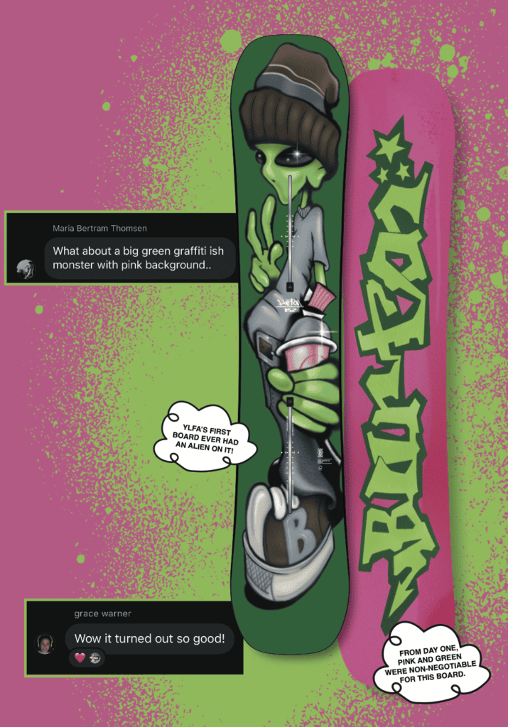
Sometimes the artist and rider are the same person. One of Gratz’s favourite W27 examples is the Good Company graphic developed with Ylfa, Maria and Grace, built around an enormous alien.
“They came with this idea and I was like, ‘You want to put a giant alien on the topsheet?’ And Ylfa was like, ‘Hell yeah, I do.’ We were like, ‘Okay. Let’s go. Let’s rock.’”
The result has become, in Gratz’s words, one of the more editorial graphics in the collection. But its significance goes beyond the alien itself.
“What I’m so excited about is we’re doing it authentically with the riders,” he says. “They can stand up and say, ‘We worked on this. We’re so hyped. Do you want to know about this graphic? I’ll tell you all about it because I was there from day one.’ The make, construction, and build of the board are what give it the performance and the technicality,” he says. “It is the graphic that brings the emotion and the expression.”
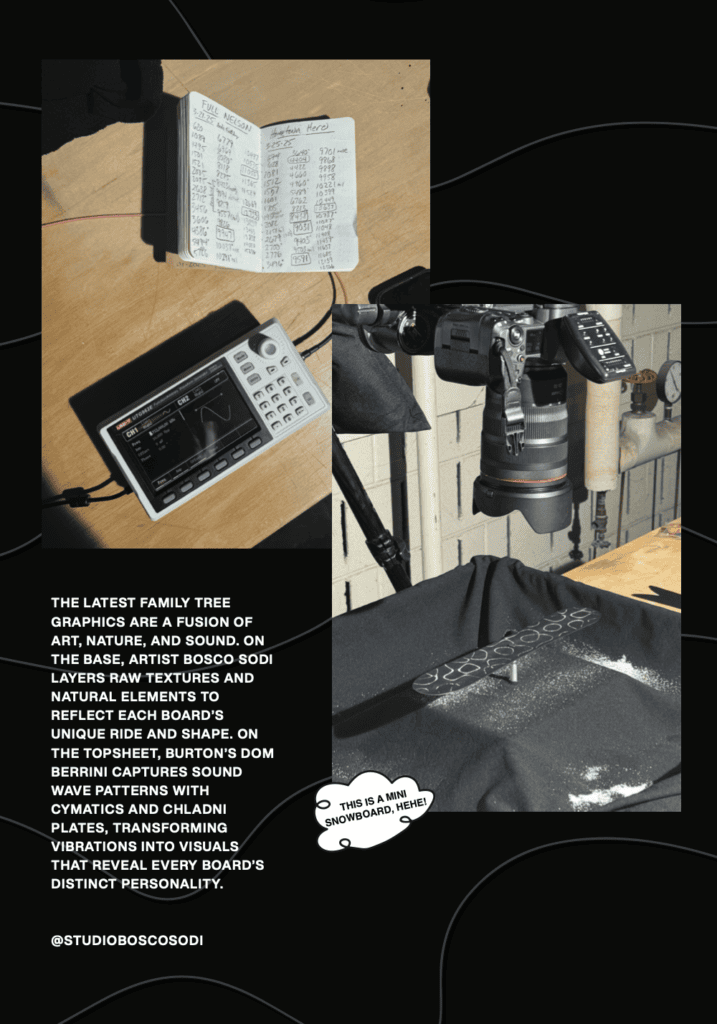
Some of this season’s designs started as proper experiments. For one Family Tree concept, a technician in Burton’s rapid prototyping and innovation team explored how sound frequencies create physical patterns.
“He was a mad scientist,” Gratz laughs. “He was like, ‘I’m going to build this and put it on the board, and I’m going to ride the board, and then we will translate the sounds and the frequency.’ We were like, ‘Whatever, dude. Cool.’”
The story is there for anyone who wants to dig into it, but the graphic still has to work without the explanation. “We’re going to create beautiful art, and the story is there if someone wants to know about it.”
Family Tree also brought Burton together with Bosco Sodi, an internationally established artist and snowboarder himself. Rather than simply licensing an existing artwork, the team involved him in deciding which pieces suited which boards. “We would say, ‘This Family Tree is more of a hard charger. This is the deep-pow board. This is the surfier, floatier shape.’” For Gratz, the point was to make Sodi an active part of how the work came to life, rather than simply receiving art files and applying them to a snowboard.
After all the references, paintings, files and production tests, there is still a moment when nobody quite knows what the finished board will look like: That’s when the first factory sample arrives.
“It’s Christmas morning because no one could imagine the happy accidents, or the things that we were hoping would work that didn’t work,” Gratz says. “It’s the first time we see how this could really start to come to life as a board graphic.”
The board that eventually appears shrink-wrapped in a shop is only the visible end of a much longer process spanning design, engineering, concepting, finishing, testing and validation. As Gratz puts it, “Every board tells a story.”
That hidden process is particularly relevant in today’s world. Burton framed this season around work that was human-made, hands-on, and full of soul. For Gratz, that is not a sudden rejection of technology or a completely new direction. Artists, manual techniques, and experimentation have always been part of Burton’s graphic process. What has changed is the desire to show more of it.
“We realized we’ve got to start telling this story louder and more often,” he says. “Working with artists and using more manual techniques to create art has always been part of our process.”
In a creative landscape increasingly shaped by generative AI, the distinction for Gratz lies in the relationships behind the finished object. “With AI, stuff appears. You can write some prompt and a couple comments, and it creates out of nothing,” he says. “That is just the exact opposite of how all of this work happens.”
Burton’s response is to open the curtain. “There’s a manual process, a human process, and editing. A back and forth and a dialogue, and a relationship between humans that creates this.”
That relationship stretches from the snowboarder who spots an artist somewhere in the world, through the designer pinning references onto a studio wall, to the artist translating their practice onto an unfamiliar shape and the production team waiting for the first sample to arrive.
For Gratz, it comes back to what Burton wants to remain. “It’s so important that we are a human brand and that we live in the real world,” he says. “Using the power of Burton to help elevate some of these artists and share their stories is really important.”
The graphics may come from all over the map, but what connects them is the people who made them.
From rails and side hits to big jumps, our pick of the

Our Pick of the Best Splitboards for Backcountry Adventures in 2026/2027 Looking

From playful freestyle boots to stiff, precision-focused all-mountain options, we take a
